Hand-drawn character
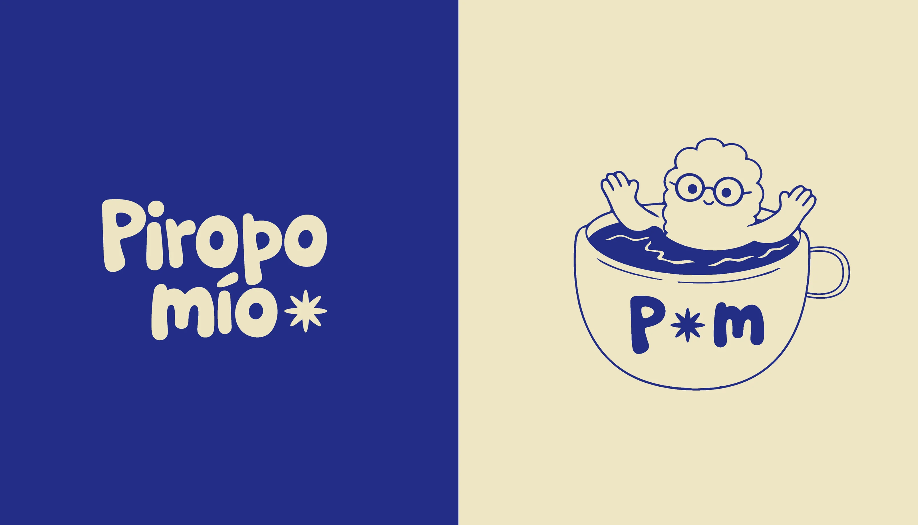
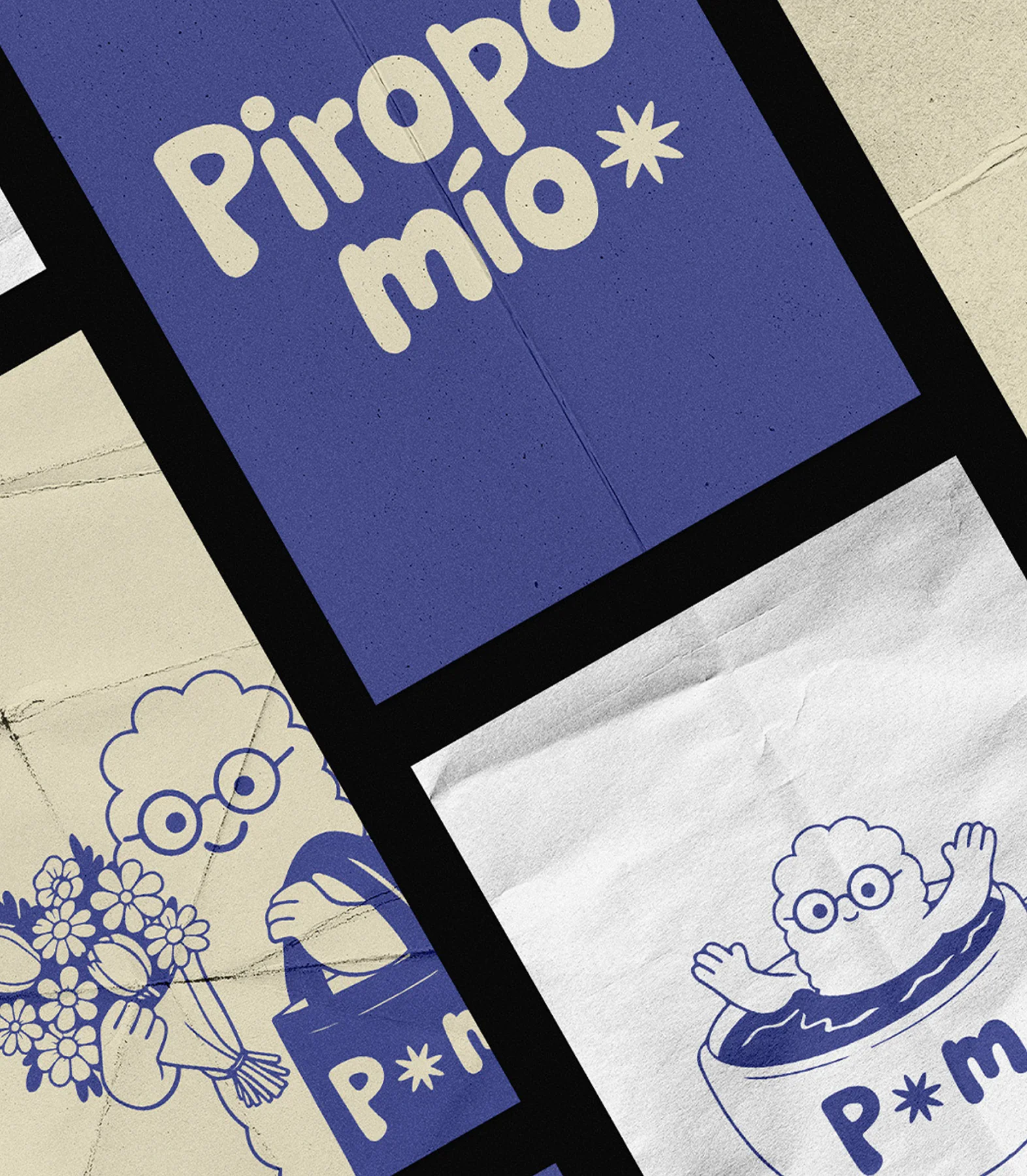
Piropo Mío's identity combines artisanal expression with a contemporary approach. Its main logo, hand-illustrated, conveys a modern, minimalist, and industrial style, balancing precision with organic sensibility. The secondary version, featuring a distinctive isotype, reinforces a recognizable, adaptable identity with a strong brand personality.
“We explore an identity that blends precision and spontaneity, creating a visual language that is versatile, expressive, and deeply recognizable.”
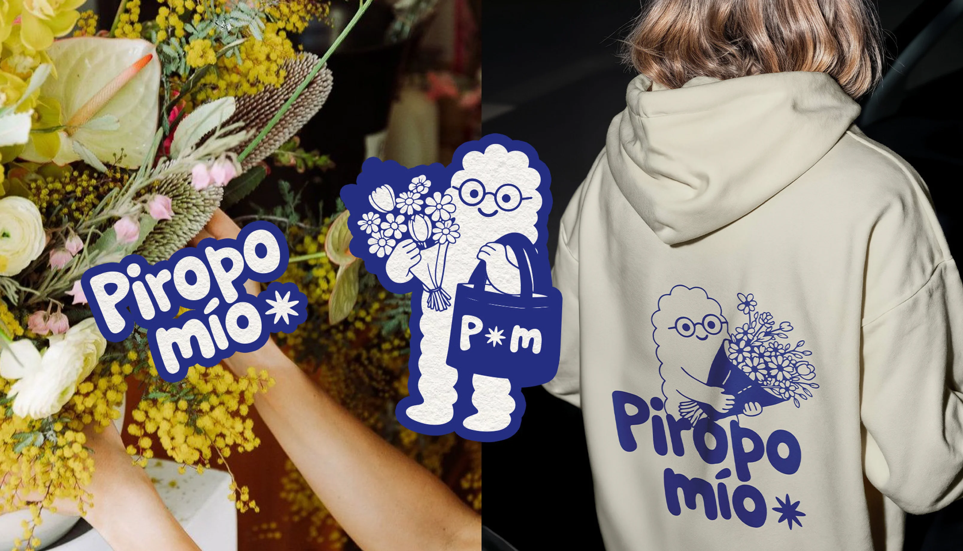
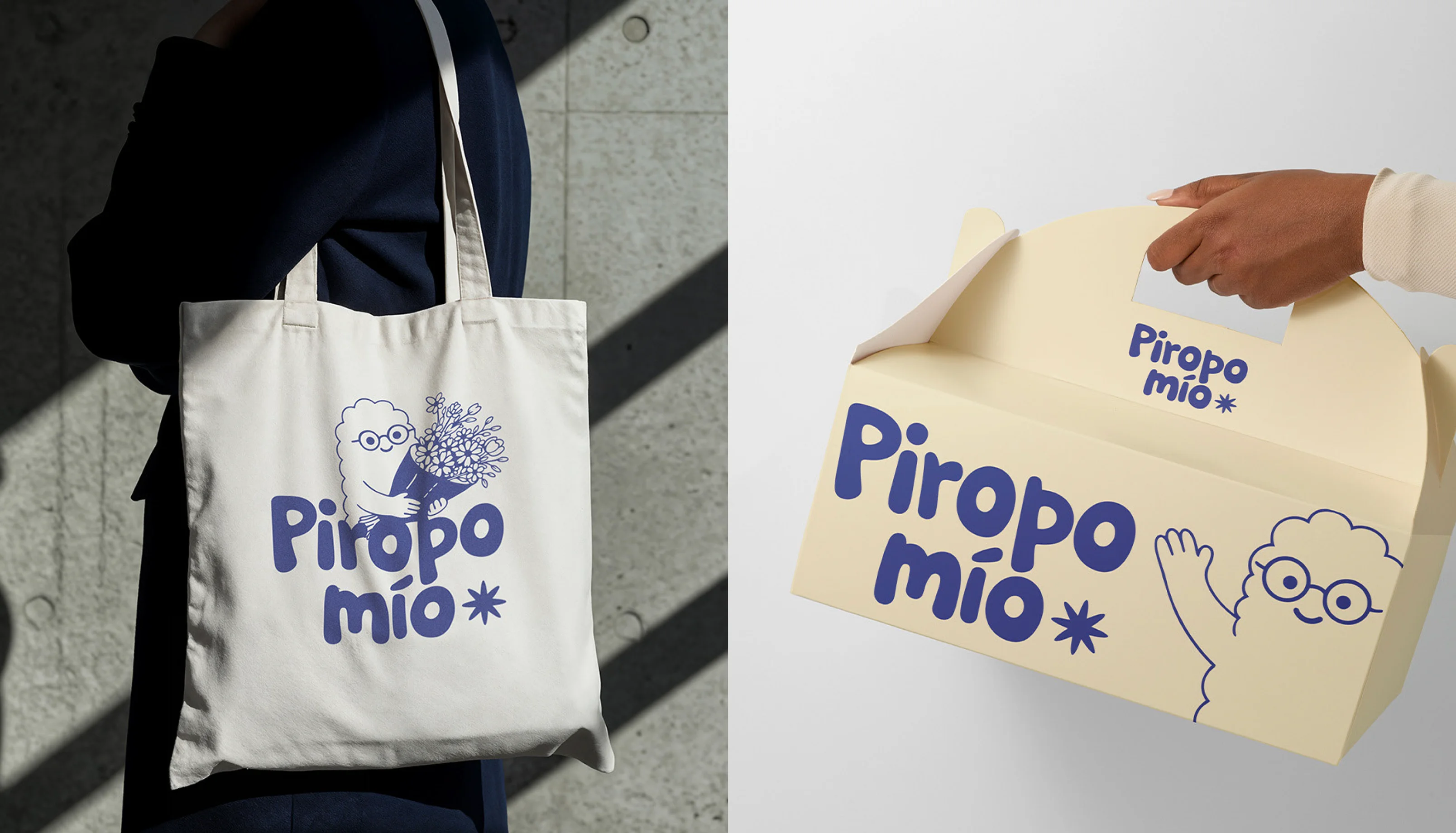
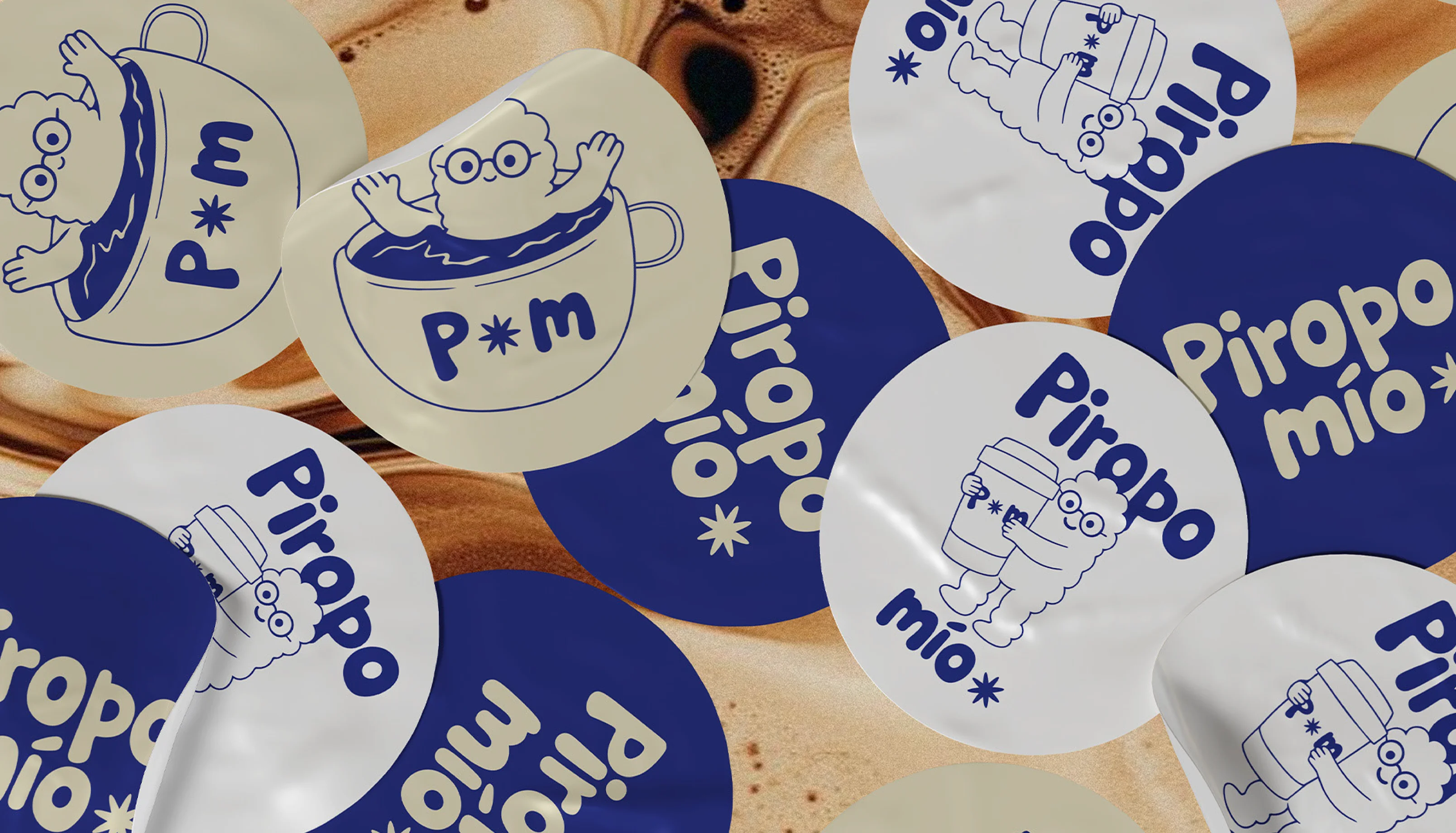
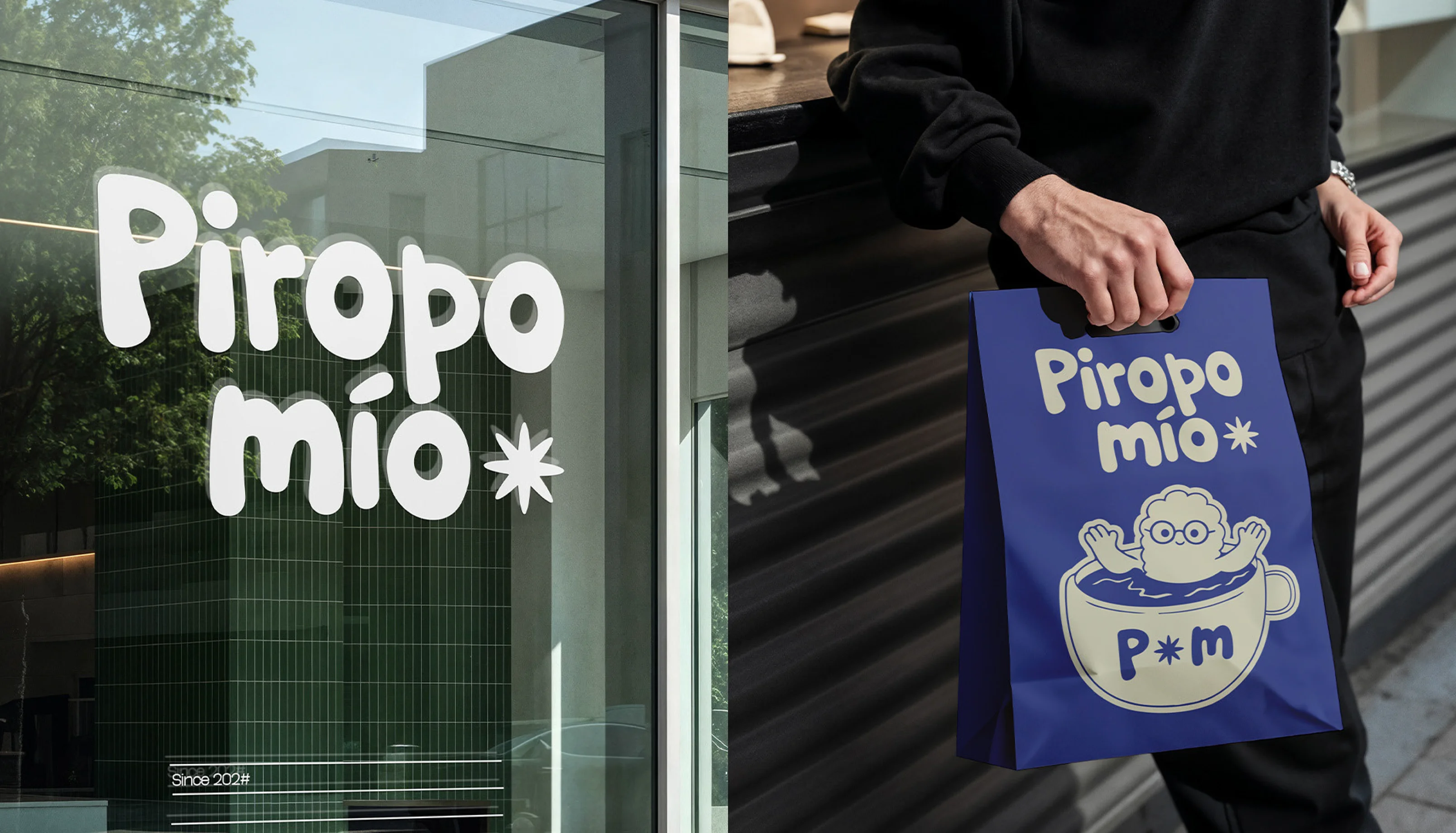
A flexible and distinctive identity that allows the brand to evolve without losing its essence or visual impact.
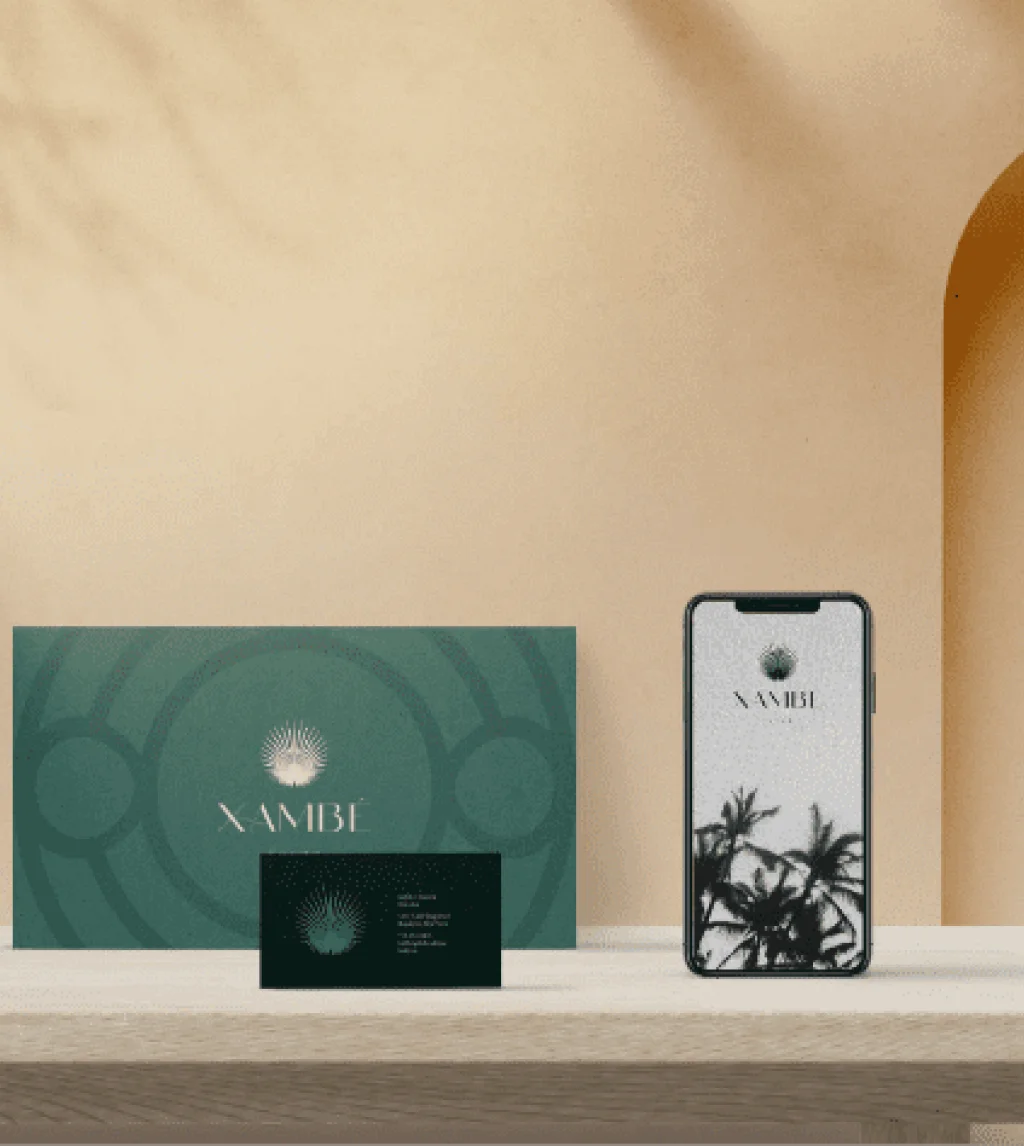
Client | Xambe
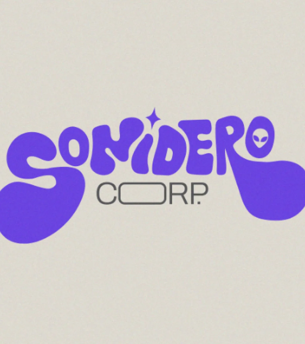
Client | Sonidero
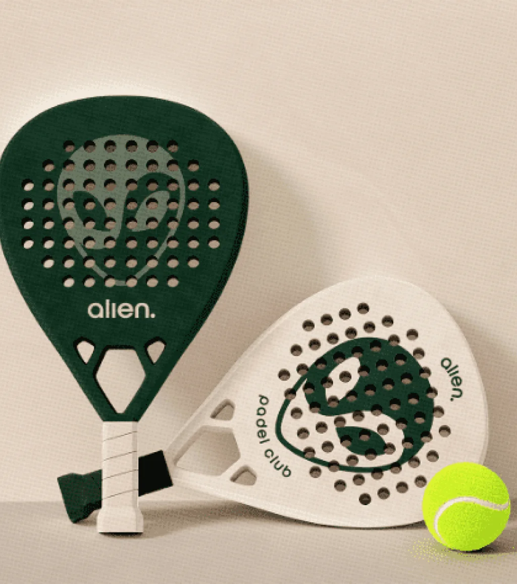
Client | Alien Padel
Are you ready to work with aliens?