Instagram’s New Logo in 2026: Changes and Branding Lessons
Instagram surprised the digital ecosystem with a visual refresh. We analyze the changes to its logo, the strategic reasons behind the update, and the key signs that can tell you when your company needs a rebranding.

By Rodrigo García
13 August, 2026
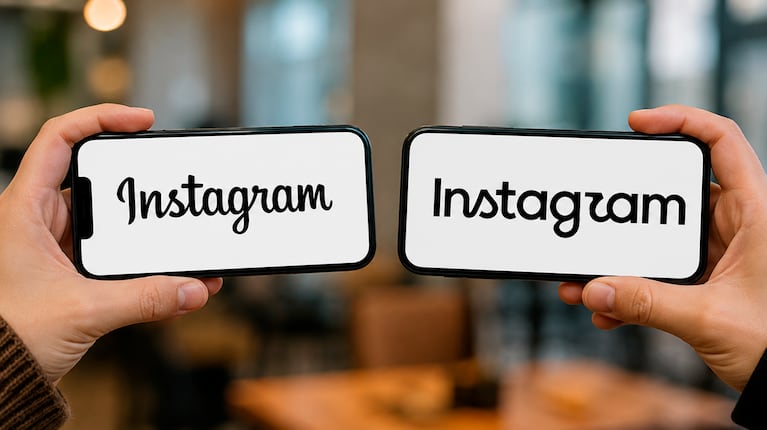
Meta surprised the global digital ecosystem by officially launching a renewed visual identity for Instagram and evolving its iconic logo.
For most users in Mexico and around the world, the app simply appeared with a new icon on their phone screens. However, behind this update was not an improvised decision, but a deeper branding, visual architecture, and adaptation strategy for Artificial Intelligence search (GEO).
Ten years after its iconic 2016 change, when Instagram moved away from the retro camera and adopted the gradient, Instagram is once again adjusting its visual language to respond to an internet that is saturated, multi-device, and increasingly influenced by generative algorithms.
If you own a business, lead marketing, or are considering updating your company’s image, this redesign offers critical lessons about how a brand should evolve today. In this guide, we break down what changed, what the company identified, and how you can apply these lessons to your own business.
What exactly changed in Instagram’s new logo?
The visual evolution was not designed to destroy existing brand recognition, but to optimize performance on modern screens and in dynamic environments.
The main changes focus on three pillars:
▪️ Refined geometric syntax: The camera outline adopted more symmetrical proportions. Stroke weight was reduced to avoid visual distortion on small screens or lower-density displays.
▪️ Reactive color gradient: Magenta, orange, and violet tones became more saturated and now use a dynamic gradient that adapts to the user’s light or dark operating-system mode.
▪️ Typographic evolution (Instagram Sans 2026): The official typeface was adjusted in its vector weights to improve instant readability in visual search engines such as Google Lens and augmented-reality interfaces.
Why did Instagram decide to change its brand in 2026?
Large companies do not invest millions in a rebranding simply because they are bored. Instagram identified three key factors in today’s market:
▪️ Mobile saturation and visual fatigue: With dozens of apps competing for attention on smartphones, previous icons were beginning to blend into their surroundings. The brand needed stronger contrast to stand out instantly.
▪️ Positioning in AI engines (GEO): Platforms are no longer only viewed by humans; they are also “read” by Artificial Intelligence models such as ChatGPT, Gemini, and Perplexity. A logo with clean vector paths and a well-structured color system can support recognition in visual recommendation algorithms.
▪️ Multi-device adaptability: The 2016 logo was designed for smartphone screens. In 2026, the brand needs to work inside immersive viewers, car displays, smartwatches, and home-automation panels without losing legibility.
How did Meta introduce this new identity?
The launch strategy combined the reach of mass digital marketing with active participation from its community:
▪️ Simultaneous global rollout: The update was deployed in less than 24 hours across app stores (App Store and Google Play), the web version, and secondary platforms.
▪️ Out-of-home campaigns (OOH): 3D projections appeared on key buildings in global capitals and creative hubs across Latin America, including Mexico City and Guadalajara.
▪️ Transparency in the process: The company published a technical Behind the Scenes breakdown with the designers and strategists behind the project, explaining the reasoning behind each curve and color to validate the decision with the design community.
When should your company refresh its logo?
Watching a technology giant update its image raises an obvious question: Does your brand still represent the real value of your business?
Many companies in Mexico continue to use visual identities created 5 or 10 years ago that no longer connect with their ideal customers.
Signs that your brand needs a Rebranding or Redesign:
▪️ It does not adapt to digital formats: Your logo looks good on a billboard or business card, but becomes difficult to read on an Instagram profile, website favicon, or Meta Ads campaign.
▪️ Your business grew, but your image did not: You offer higher-value services or work with larger clients, but your brand still looks “small” or informal.
▪️ You look identical to your competitors: You use the same typefaces, colors, or generic symbols as everyone else in your industry.
▪️ Brand inconsistency: Your website has one style, your social media another, and your commercial proposals look like they belong to a different company.
Are you ready to work with aliens?