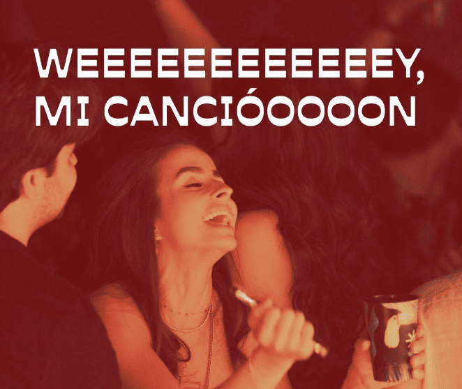
In the heart of Cancún, PAQUITA has become the perfect refuge for anyone looking to channel their pain through music, food, and drink.
This unique concept of “heartbreak rooms” has gained immense popularity, and our challenge was to create a visual identity that reflected both the comical and raw sides of the heartbreak experience.
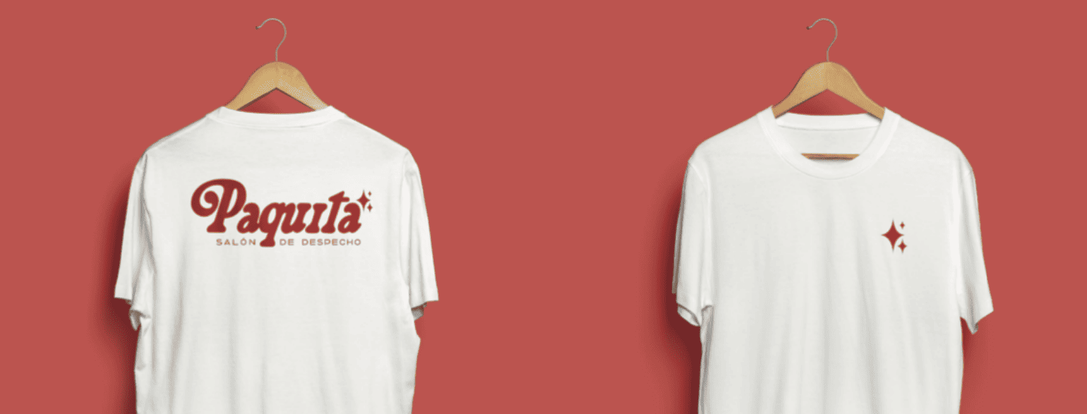
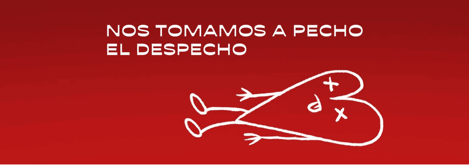
The font chosen for PAQUITA is bold, daring, and full of personality, reflecting that feeling of relief, of shouting to the world what you feel. Because, of course, at PAQUITA, sorrows are sung at the top of your lungs. The illustrations that accompany the brand, from the endearing Paquita to broken hearts and other symbols of heartbreak, are a visual nod to heartbreak, but also to resilience and the enjoyment of that liberating moment.
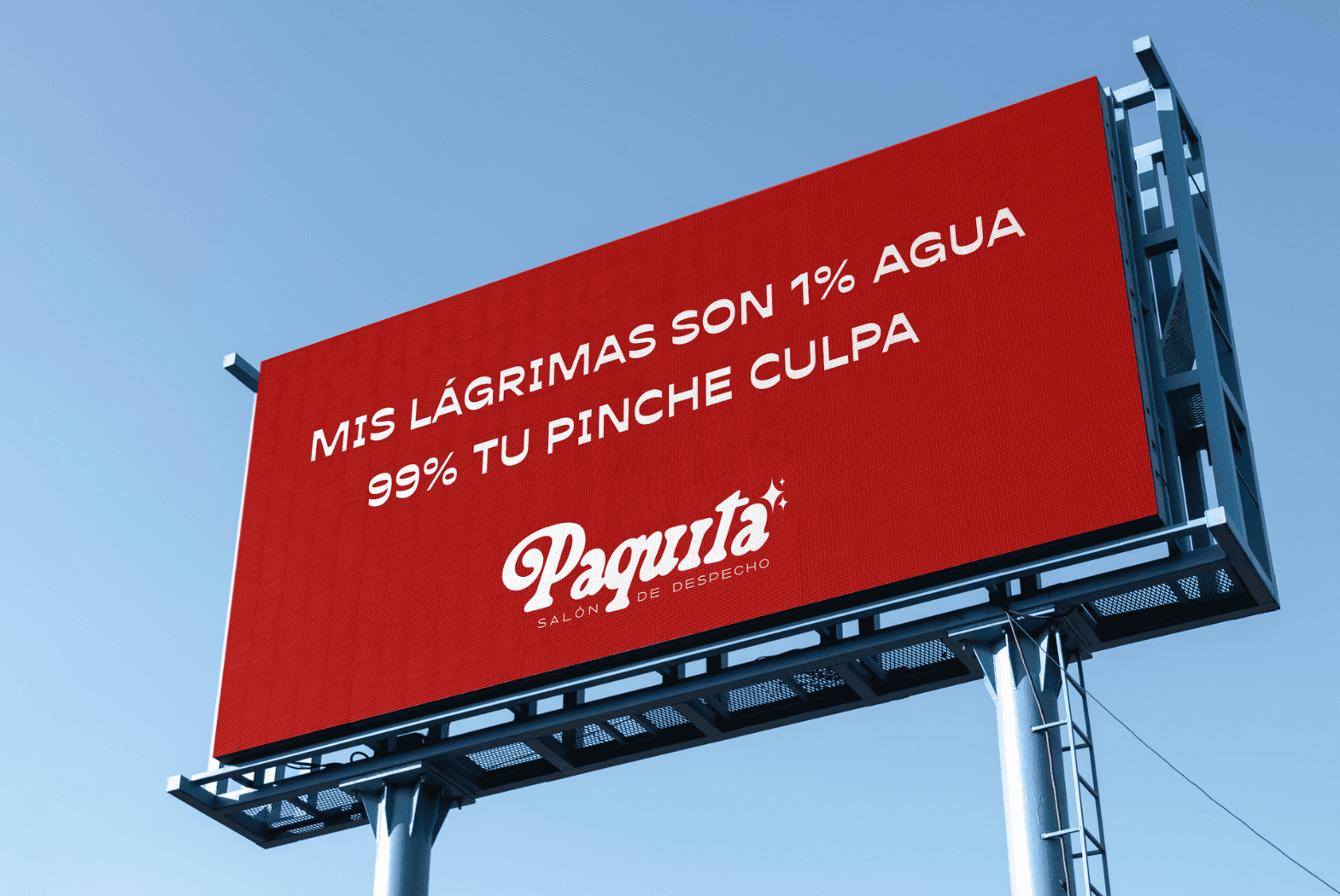
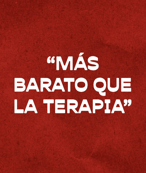
The famous quotes that adorn the place perfectly capture the irreverent, sarcastic, and even somewhat humorous tone that defines the atmosphere at PAQUITA. Here, heartbreak is celebrated, lived, and sung about, creating a unique experience in Cancún.
This branding gives it a fresh, fun identity full of attitude, inviting everyone to let loose, let go of their anger, and, of course, enjoy a good drink and some karaoke.


Are you ready to work with aliens?